Typography is key to creating consistency across the ISTA brand.
Our fonts have been chosen to exude clarity, optimism, and progress. The consistent use of appropriate font choices, scaling, spacing, and alignment is integral to effective use of the ISTA brand visuals.
Typography at ISTA operates across two distinct domains: document-based text and design-integrated text. The guidelines below focus primarily on document typography—text within Word documents, PowerPoint presentations, and similar materials where clarity, consistency, and readability are paramount. For visual assets where text functions as a design element, we maintain creative flexibility. When questions arise about appropriate typography choices, the Communications Team is available to provide guidance.
Overview
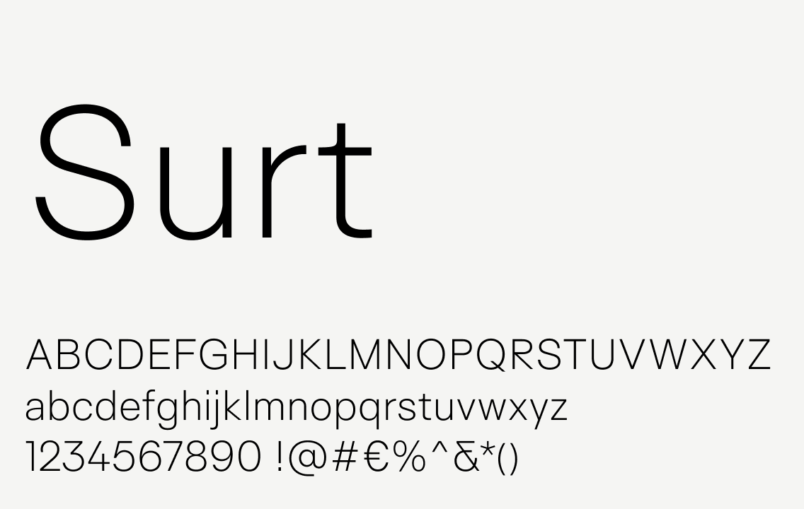
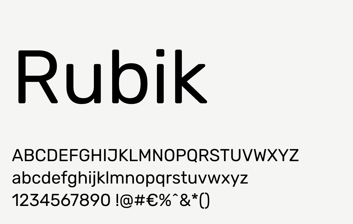
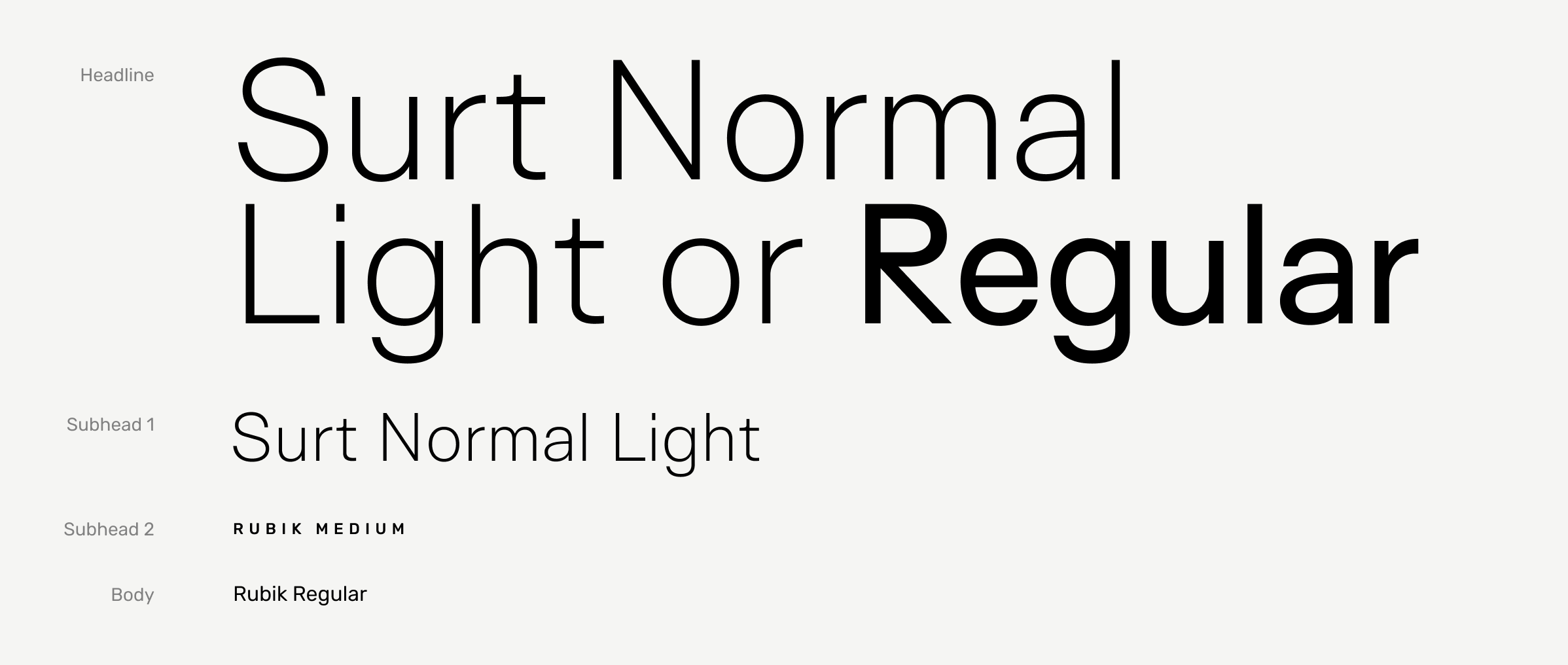
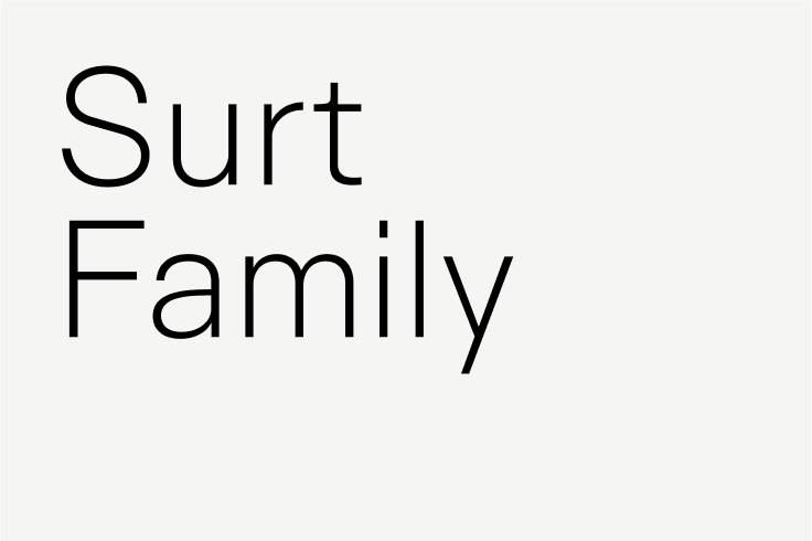
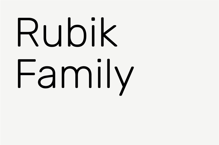
The ISTA visual language is deeply influenced by the character of the brand fonts and how they’re used. Surt is used for titles and headlines and Rubik is used for subheadlines and body copy.
Alternate fonts: In cases where it’s absolutely not possible to use Surt and/or Rubik, choose Arial (Regular). For example, in emails and email signatures, use Arial as a substitute as it’s the closest universally-available font to the brand fonts.
Tip
When creating and sharing documents in PowerPoint, it is critical to embed the fonts so they do not default to other fonts when opened on another computer. To do this on a PC, when in PowerPoint, go to File > Options > Save. Under “Preserve fidelity when sharing this presentation,” check the box next to “Embed fonts in the file” and specify to “embed all characters” (this allows others to make edits to the document while maintaining the font specifications). On a Mac, this option is found under the PowerPoint menu > Preferences > Save.
Tip
For research papers or similar documents created in Word, it is important to use the kerning functionality within the program. (This will prevent odd spaces between letters which are particularly noticeable with all caps, such as “ISTA”.) Under Format > Font, select the Advanced tab and make sure the box next to “Kerning” is checked. You can set it to “above 1 point” to make sure that this applies to all the text in your document. This ensures the Surt and Rubik fonts you are using in the document are properly spaced.
Typographic hierarchy
Proper typographic hierarchy is crucial for legibility, clarity, and consistency. It communicates to the reader the most important content, helps orient within the composition or document, and serves as a guide through the information.
Tip
When stepping down a level in type hierarchy, the type size should be 60-70% smaller (or roughly 1/3 the size). For example, if a headline is set at 90pt, the subhead should be 36pt or 30pt and the body copy should be about 12pt. This is a rough guideline and can be adapted to fit the circumstances.
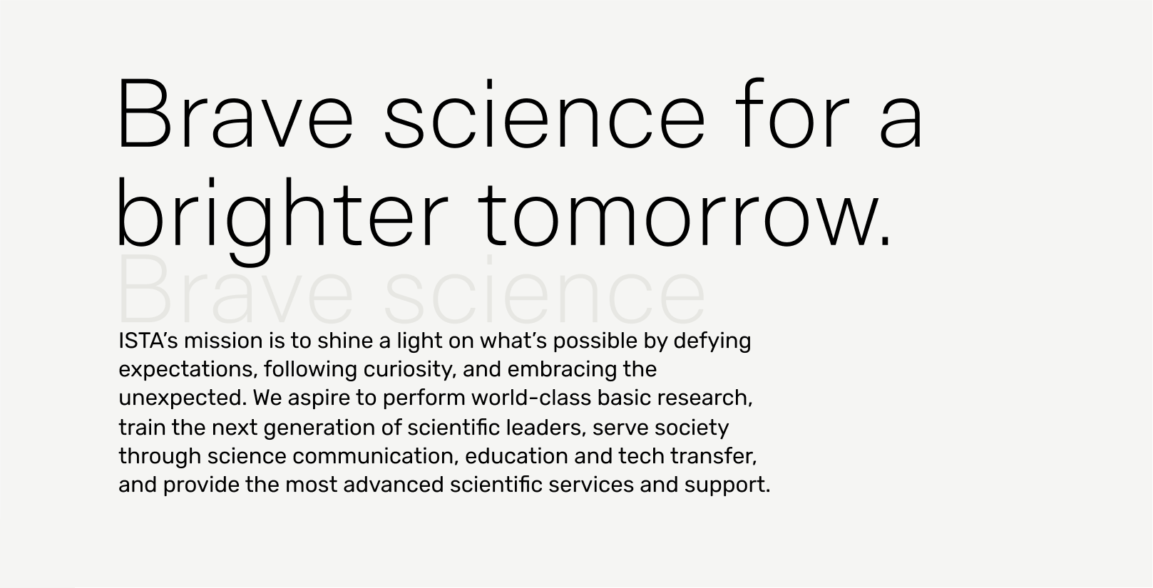
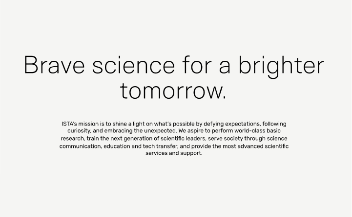
Headlines
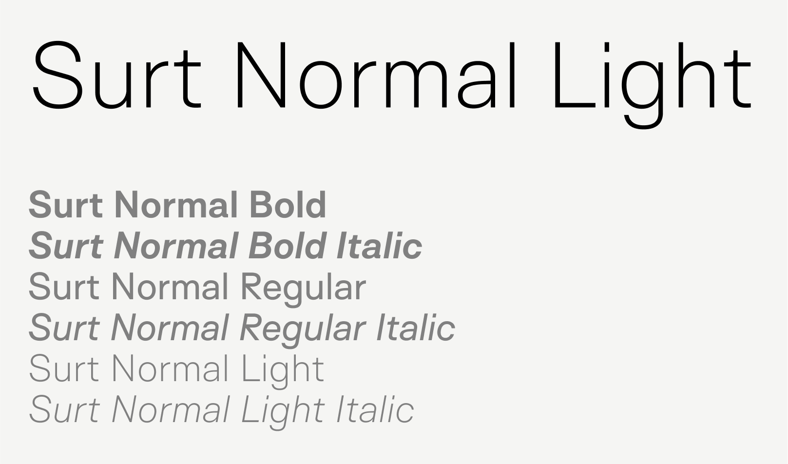
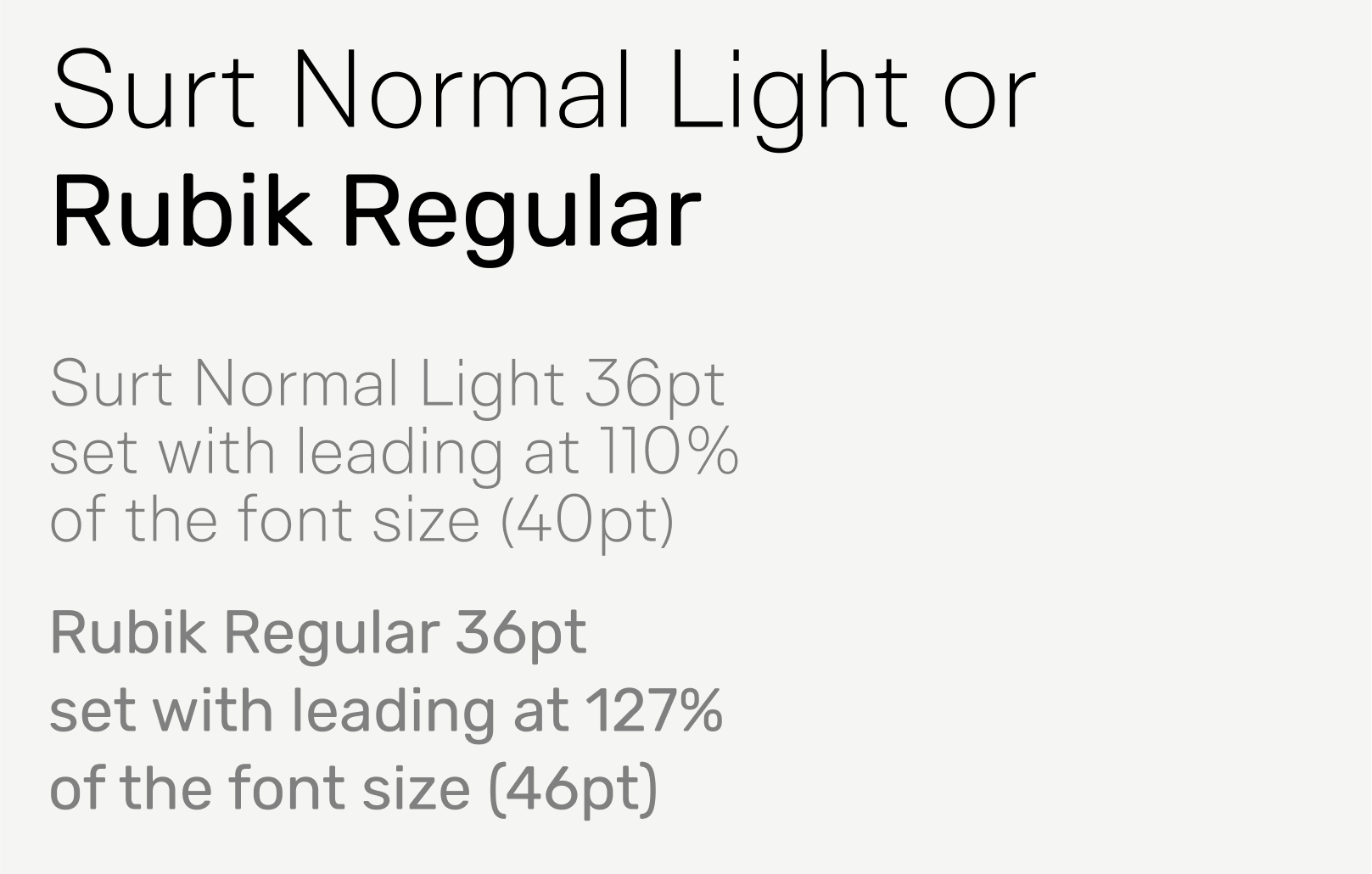
Headlines are the largest text in a composition or document and should exclusively use a font from the Surt typeface family. A variety of weights are available to accommodate various communication needs, but Surt Normal Light is the recommended weight for most applications.
Recommended styling
Weight
Surt Light or Rubik Regular
Capitalization
Title case*
Line height
110% to 130% of font size
Letter spacing
0% (standard)
Notes
The largest text on the page should be set in Surt.
Italics and bold should be reserved for emphasis of individual words or short phrases and used sparingly.
Most headlines should be set in Surt Normal Light, but Surt Normal Regular can be used in certain instances where additional weight is needed in order to achieve an acceptable level of legibility or to provide additional visual weight in a complex layout.
* ISTA uses The Chicago Manual of Style guidelines for capitalizing titles (e.g. The Tipping of the Last Resilient Glaciers).
Subheadline 1
Subheadlines are the second-most important text in a composition or document.
Recommended styling
Weight
Surt Light or Rubik Regular
Capitalization
Sentence case
Line height
110% to 130% of font size
Letter spacing
0% (standard)
Notes
Key to maintaining a polished, cohesive look across a document is consistent sizing and spacing of typography. It’s recommended that all headlines should be the same size across a document.
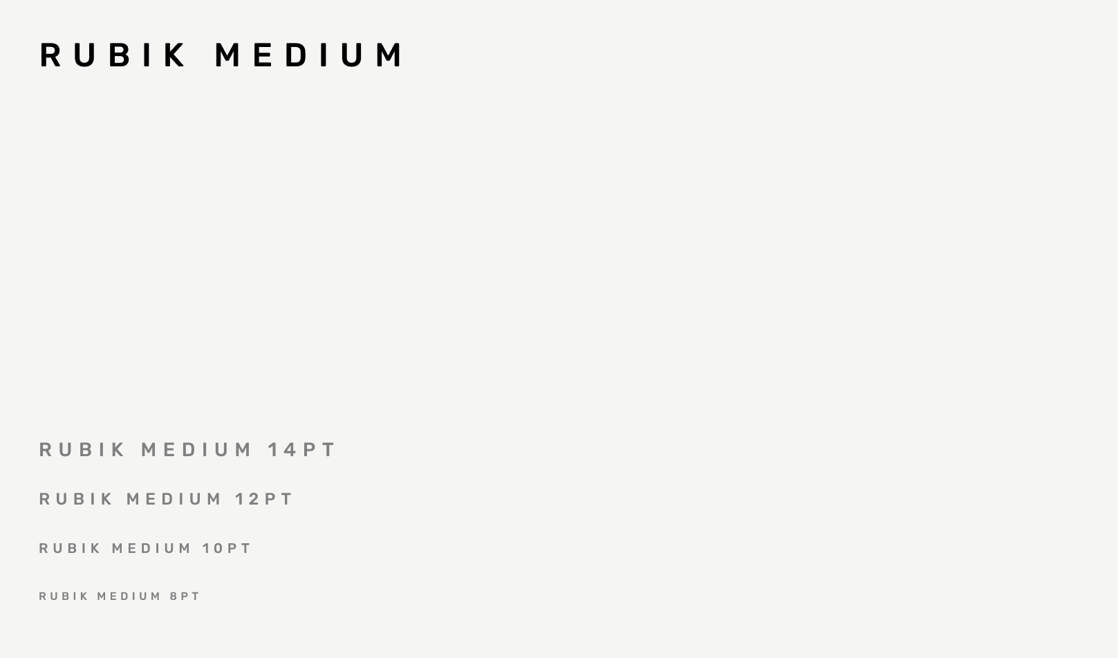
Subheadline 2
Subheadline 2 is a type style used to designate subsections of a document. For example, the tab above this paragraph is a subheadline set in a rectangle.
Recommended styling
Weight
Rubik Medium
Capitalization
All caps
Line height
120% of font size
Letter spacing
34% (Adobe: 150)
Notes
Multi-line subheadlines are uncommon. If you find yourself needing a multi-line subhead, reexamine your type hierarchy before proceeding.
If readability is an issue, try using Semibold before making type bigger.
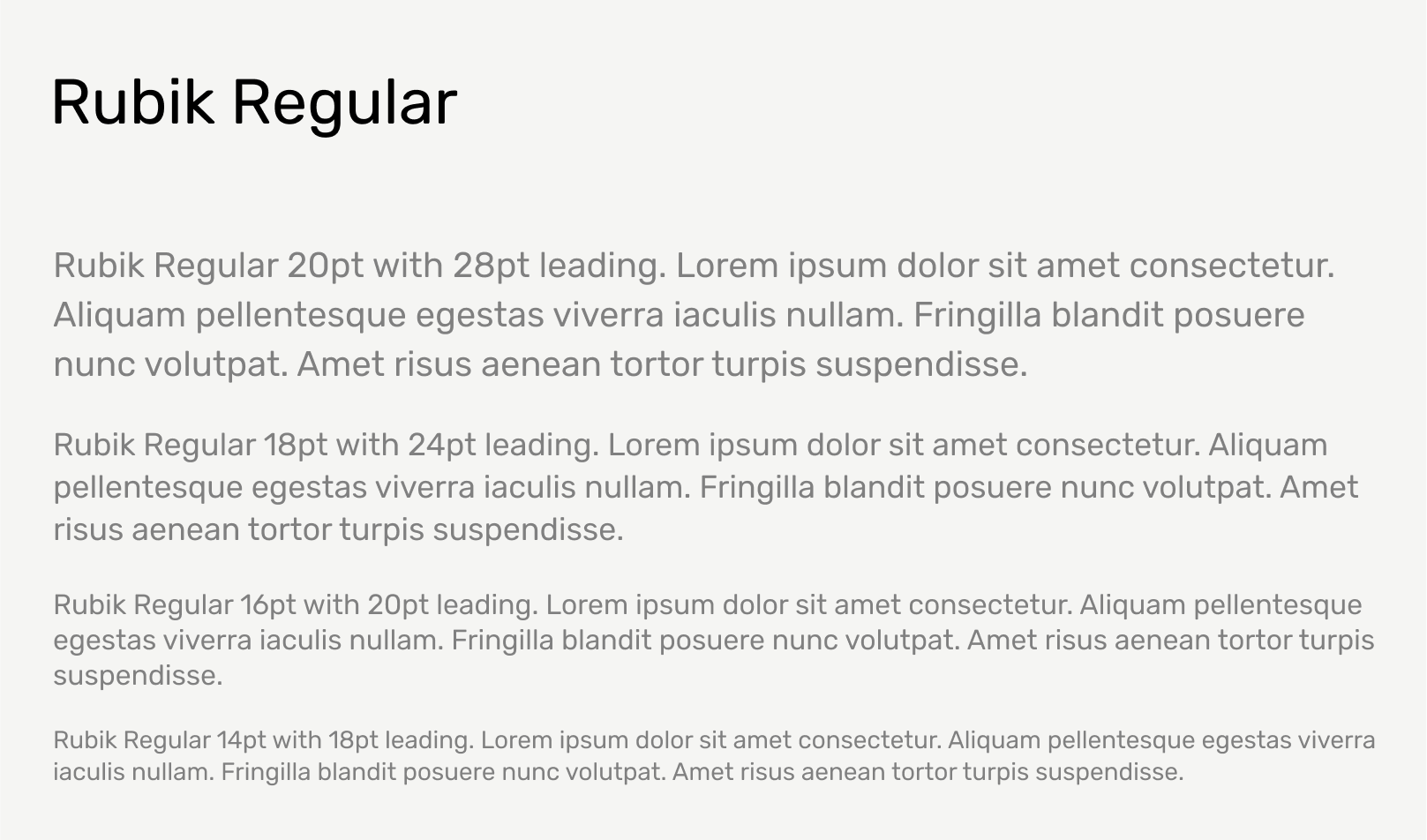
Body
Body text is the most detailed level of text in a composition. It usually makes up the majority of words on a document or is the least important information on the page and is therefore smaller. For smaller text like this, the leading should be somewhere between 120% and 140% of the type size. Use this range as a starting point, but always optimize based on the application.
Recommended styling
Weight
Rubik Regular
Capitalization
Sentence case
Line height
120% to 140% of font size
Letter spacing
0% (standard)
Alignment
Left
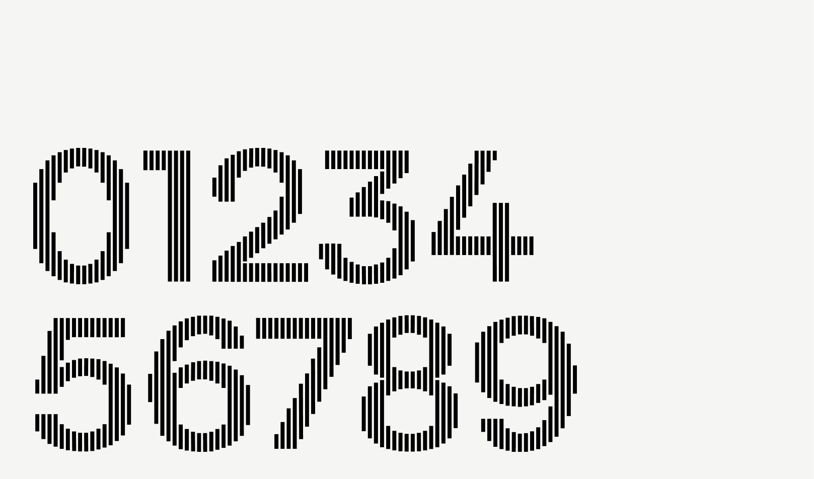
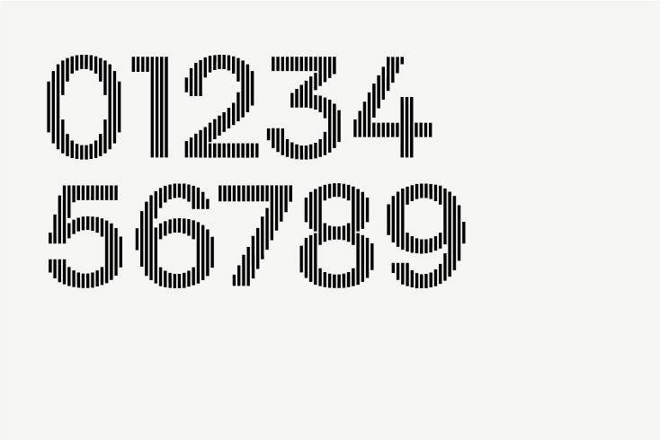
Custom Numerals
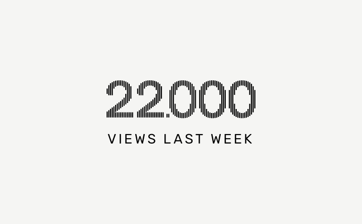
Developed for ISTA, these custom numerals are based on the Surt typeface and subtly connect to the bars in the ISTA logomark and reinforce the underlying grid structure of the brand. These numerals should only be used at larger sizes where numbers are deserving of special attention. Do not use at small sizes.
Download the custom ISTA Numerals font (via the Intranet). Install as you would any font files.
Recommended usage
Use the following recommendations for spacing, line length, and alignment to maximize readability and consistency.
Spacing between a headline and paragraph should be about the height of one line of headline type. Where possible, ensure the text aligns to the grid system.
Notes
Ideal headline line length is 3-4 words or about 12-24 characters long.
Ideal paragraph line length is about 9-15 words or about 60-85 characters long.
In the composition above, the subheadlines are anchored around the central connection point between the two rectangles. “Free entry” could be right aligned to gravitate towards this central dividing line, but the enveloping box has equal margins on both sides of the text in order to give the appearance of being full-justified.
Notes
Text should always be left-aligned unless it is part of a more complex layout that requires balance. In those instances, care should be taken to give the appearance of full justification instead of right-alignment.
Example
Text set in a box or button is the exception to the rule; this text should be centered and aligned to the grid.
Tip
If you are ever inclined to center-align text, it could be a sign that the composition is lacking interest or a strong visual focus. At that point, it’s probably worth asking the question, “How can I make this composition more interesting or clear?” Refer to the Grid + Layouts or the Branded Examples for more guidance and inspiration.
Download the custom ISTA Numerals font (install as you would any font files).
Tip
There are additional language guidelines to ensure clarity, consistency, and readability across ISTA documents. Please refer to the Communications space on the Intranet for more information.