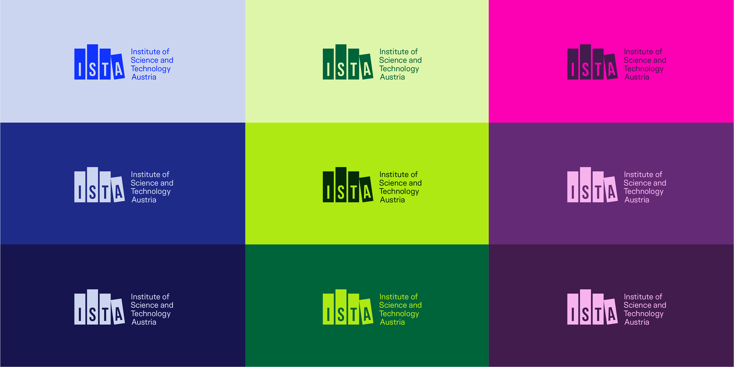
Below, see how the ISTA palette is used consistently and expressively, a key characteristic of the overall brand identity.
ISTA’s color palette is intrinsically linked to the core concept of brave science. The three brightest colors of the palette (plus black) have been pulled directly from scientific imagery that you might see across campus, in research publications, and in the scientific world beyond ISTA. These vibrant, bold colors anchor the palette and the rest of the colors are lighter and darker iterations of these main brights.
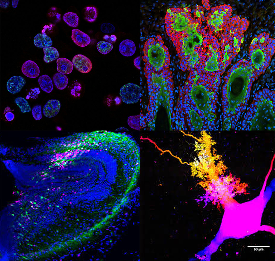
© Developmental Cell/Jaeger, Vijatovic, Deryckere, et al.
© Jake Watson
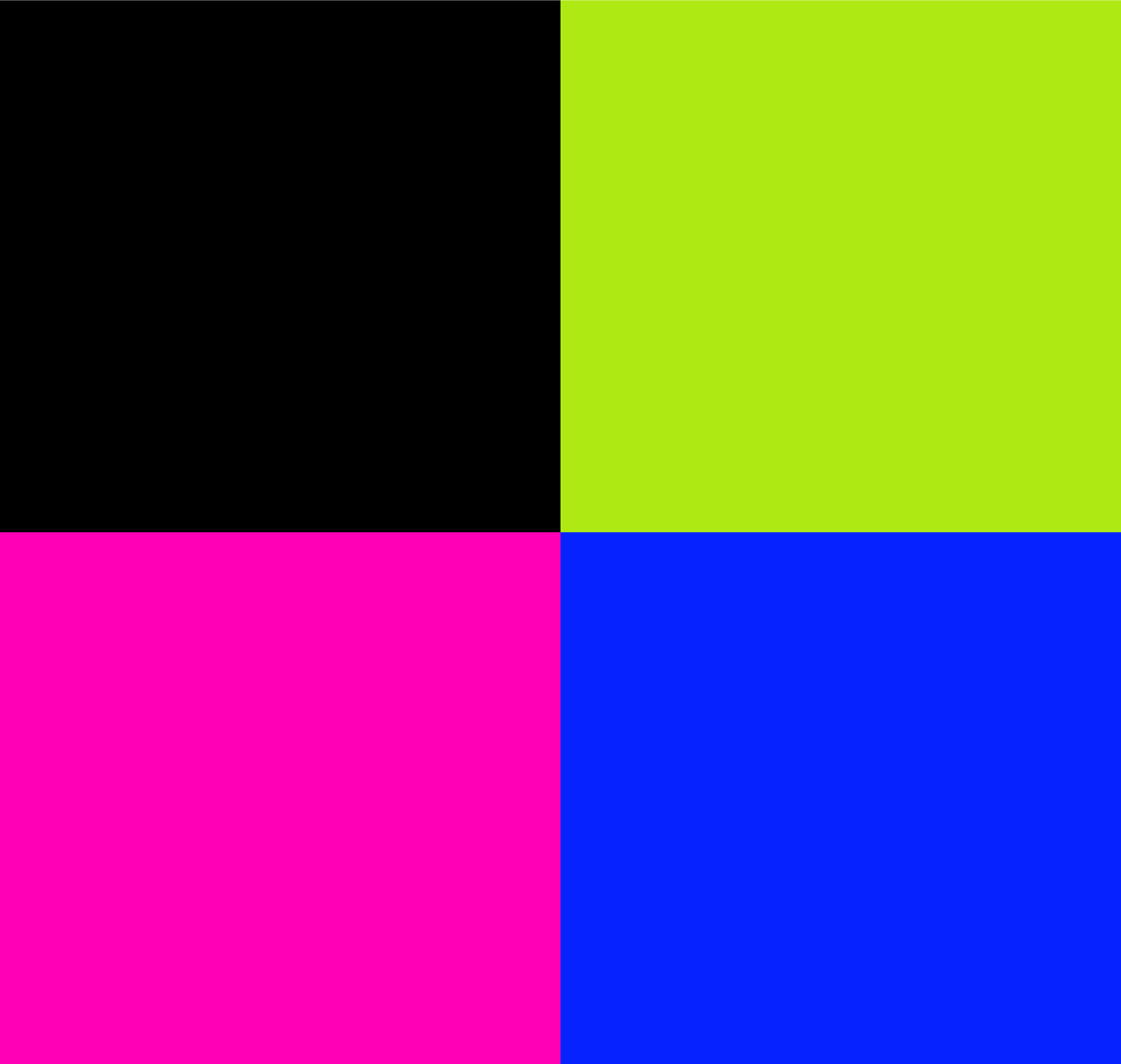
The color palette uses a four column ‘gradient’ structure, ranging from light/soft to deeply saturated, as seen below. The left column, consisting of grays and black, can be used when more neutral colors are needed. The other three columns, comprised of greens, magentas and blues, can be used for any branded collateral. There is no hierarchy among those hues in terms of priority or usage, which is a non-traditional way to handle color, but one that gives us endless possibilities within the perimeters of this palette and reflects ISTA’s progressive, unique position within the scientific landscape.
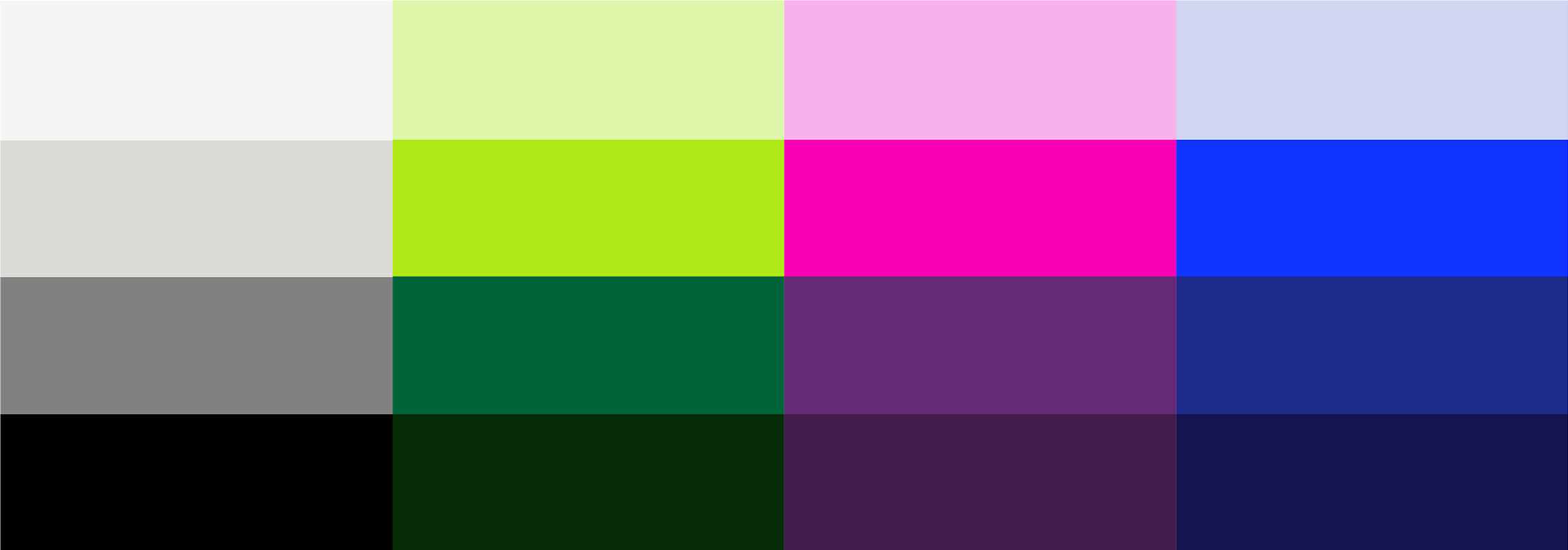
Use the following color codes exactly as listed below. RGB (or hexcode) should be used for all digital and online materials. CMYK is used for print, specifically four-color printing. PMS (Pantone Matching System) numbers are also used for print, when production allows for custom inks. Download the color palette here.
HEX: F5F5F3
RGB: 245, 245, 243
CMYK: 03, 02, 03, 00
Pantone: PMS Warm Gray C @ 20%
HEX: DBD9D4
RGB: 219, 217, 212
CMYK: 13, 10, 14, 00
Pantone: PMS Warm Gray C
HEX: 808080
RGB: 128, 128, 128
CMYK: 52, 43, 43, 08
Pantone: PMS 4278 C
HEX: 000000
RGB: 0, 0, 0
CMYK: 75, 68, 67, 90
Pantone: PMS Black C
HEX: DEF6AA
RGB: 222, 246, 170
CMYK: 15, 00, 42, 00
Pantone: PMS 372 C
HEX: AEE914
RGB: 174, 233, 20
CMYK: 36, 00, 100, 00
Pantone: PMS 2290 C
HEX: 00643A
RGB: 00, 100, 58
CMYK: 90, 35, 92, 29
Pantone: PMS 349 C
HEX: 062D08
RGB: 06, 45, 08
CMYK: 79, 52, 86, 70
Pantone: PMS 627 C
HEX: F7B2EC
RGB: 247, 178, 236
CMYK: 06, 34, 00, 00
Pantone: PMS 2365 C
HEX: FC00B4
RGB: 252, 00, 180
CMYK: 07, 90, 00, 00
Pantone: PMS 807 C
HEX: 652A76
RGB: 101, 42, 118
CMYK: 73, 100, 20, 07
Pantone: PMS 2613 C
HEX: 411C4C
RGB: 65, 28, 76
CMYK: 79, 98, 38, 38
Pantone: PMS 2627 C
HEX: CFD6EF
RGB: 207, 214, 239
CMYK: 16, 11, 00, 00
Pantone: PMS 2706 C
HEX: 1134FF
RGB: 17, 52, 255
CMYK: 85, 73, 00, 00
Pantone: PMS 2132 C
HEX: 1F2B89
RGB: 31, 43, 137
CMYK: 100, 97, 11, 03
Pantone: PMS Reflex Blue C
HEX: 17154F
RGB: 23, 21, 79
CMYK: 100, 100, 33, 39
Pantone: PMS 2768 C
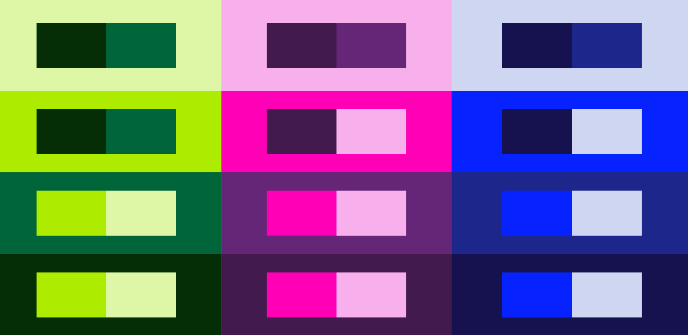
The preferred approach for applying the ISTA palette is to start with colors within the same family and use a tone-on-tone effect, which creates a cohesive and sophisticated aesthetic. Other colors can be added in small touches, for emphasis and appeal, but be careful when using many of the colors on the same piece; you don’t want to create a ‘rainbow effect’ or a final piece that’s too busy or overwhelming. Typical tone-on-tone color combinations look like this:
The logo can be used within the tone-on-tone approach as well. This allows the ISTA brand assets to seamlessly integrate with the rest of the piece, whether it’s a LinkedIn post, a printed flyer, ISTA merchandise, or any other branded collateral. This also allows the ISTA brand to (literally) have a more colorful presence, connecting to the core value of inviting many voices and perspectives to the work being done at ISTA.
A few examples of the Main Lock-up in tone-on-tone colors:
Tone-on-tone color palette examples:
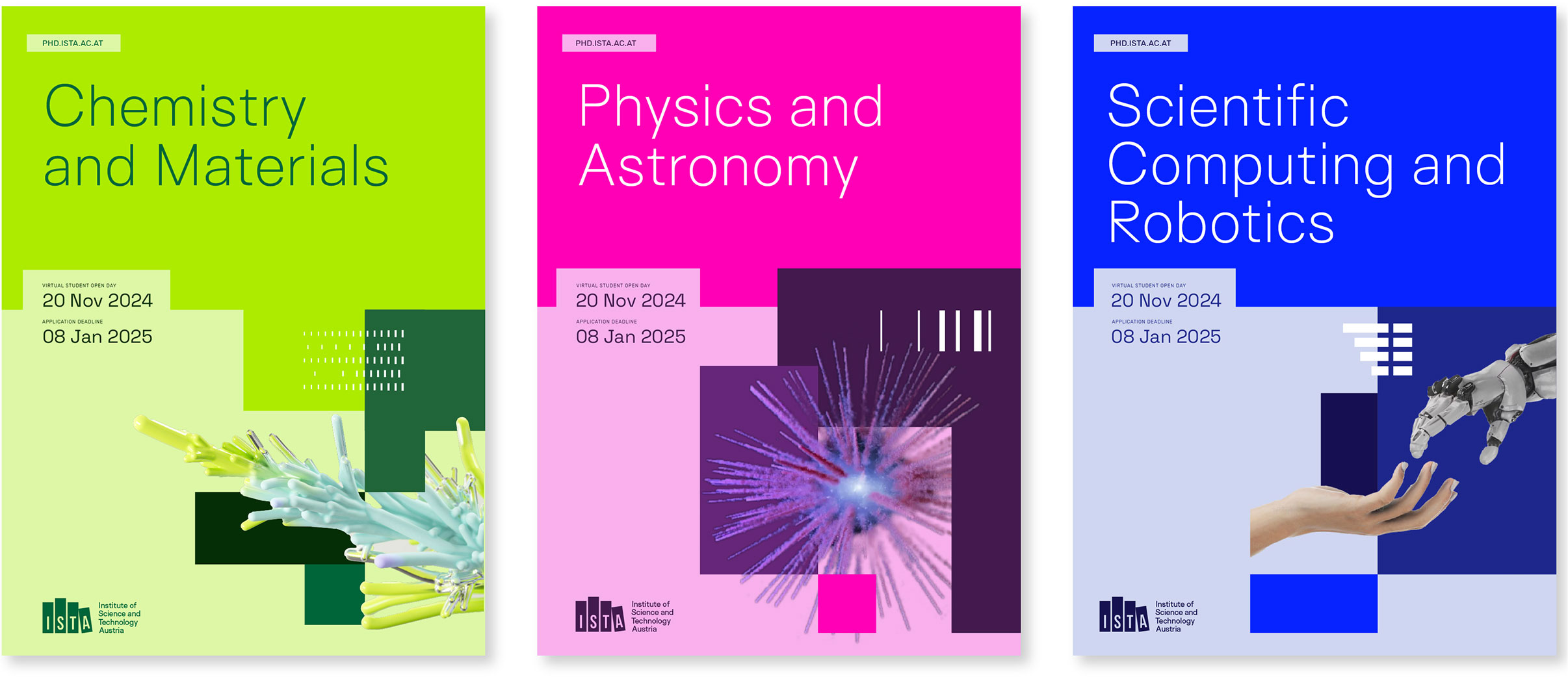
These conceptual study track flyers showcase the tone-on-tone color palette usage by combining different elements of the brand assets: dynamic use of the grid system, color blocking, collage and overlapping elements, and subtle hints of the brand patterns.
One of the most important aspects of accessibility applies specifically to color: contrast. Having enough differentiation between foreground and background is important for clear readability on screen.
Size also plays a role in this evaluation. Lower contrast can still be effective if elements are larger scale, but when you are using smaller components, higher levels of contrast is valuable. The tone-on-tone colors have been optimized for contrast but it’s still useful to double check the contrast levels for your exact situation.
Contrast levels are less important for non-critical elements used solely for texture or aesthetic interest. In the example below, the bright blue and navy colors in the right-hand example do not have enough contrast for the logo or copy. But if you’re using those colors in large blocks to create a grid or pattern, that may be fine as it’s not critical information to decipher.
Learn more about accessibility standards in general.
Check specific contrast levels.


When using the color codes above to specify the colors needed for any branded collateral, keep in mind the end destination or production method and use the correct color mode.
For digital/onscreen materials, use RGB or Hexcode.
For printed materials, use CMYK or Pantone (PMS).
Colors are inherently less vibrant in CMYK than when viewed on screen in RGB.
This is because on screen, all colors are back-lit, and the available gamut of colors in RGB is broader than that of CMYK. This is particularly true of the brightest colors in the ISTA palette. The colors were developed with digital in mind first, as that’s the most common and most frequent way these colors will be viewed (optimizing for print-first is a more out-of-date methodology). But do remember that you will see a difference in the vibrancy of the colors when printed, particularly on uncoated paper.
The recommended approach is to take every step possible to ensure the best results. See below for more information. If in doubt or guidance is needed, please get in touch with the communications team.
Employ the following tips to maximize color accuracy when printing:
Talk to the printer/vendor.
Carefully and specifically explain what you are aiming for in terms of the final printed product by providing samples of the target color(s). Printers and production teams know their equipment the best; ask them for recommendations on how to achieve your color goals.
Use high quality paper or materials.
Printing on high quality, super smooth, bright white paper can improve the brightness and vibrancy of the printed colors. Any substrate you print on, whether fabric, paper, vinyl, canvas, etc., will affect the final result — use the highest quality materials available whenever possible.
Use spot (Pantone) colors.
If possible, use Pantone inks for specific colors, especially the brightest hues. For example, if your printed brochure uses a lot of the bright blue, consider using a Pantone ink for that color. There is a cost for this additional ink color but it can be worth it if the budget allows.
Run test swatches.
Whether using an offset printer or an in-house color printer, print or ask for a test sheet of color swatches and adjust as needed to print the colors as close to target as possible. Printers do not typically supply these automatically but will if you ask for it and explain the importance of color matching.
Review color match proofs.
Before a large production run of a printed piece, be sure to receive and approve color accurate proofs (for digital printing, this proof is often an exact one-off of your project). If you are only reviewing proofs online (PDF or on a website), this is not an accurate representation of how the colors will print.