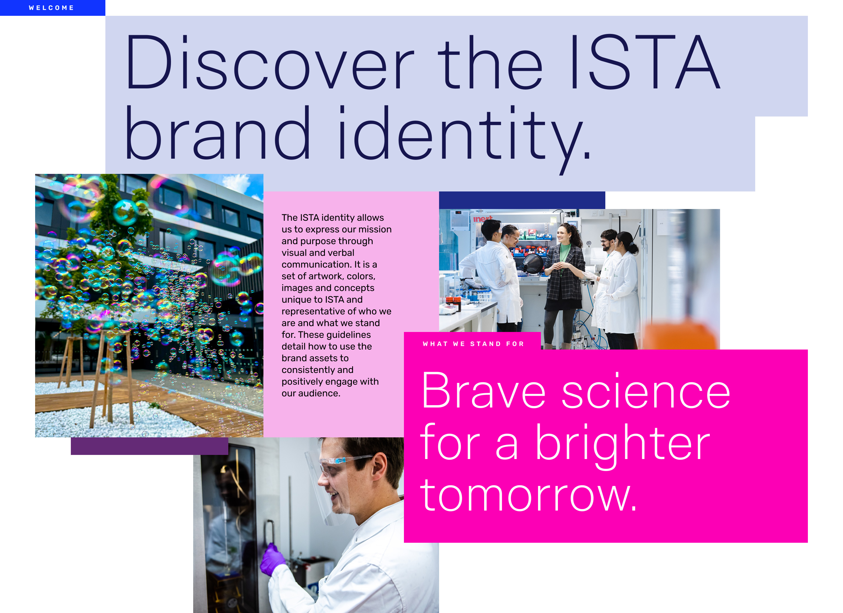
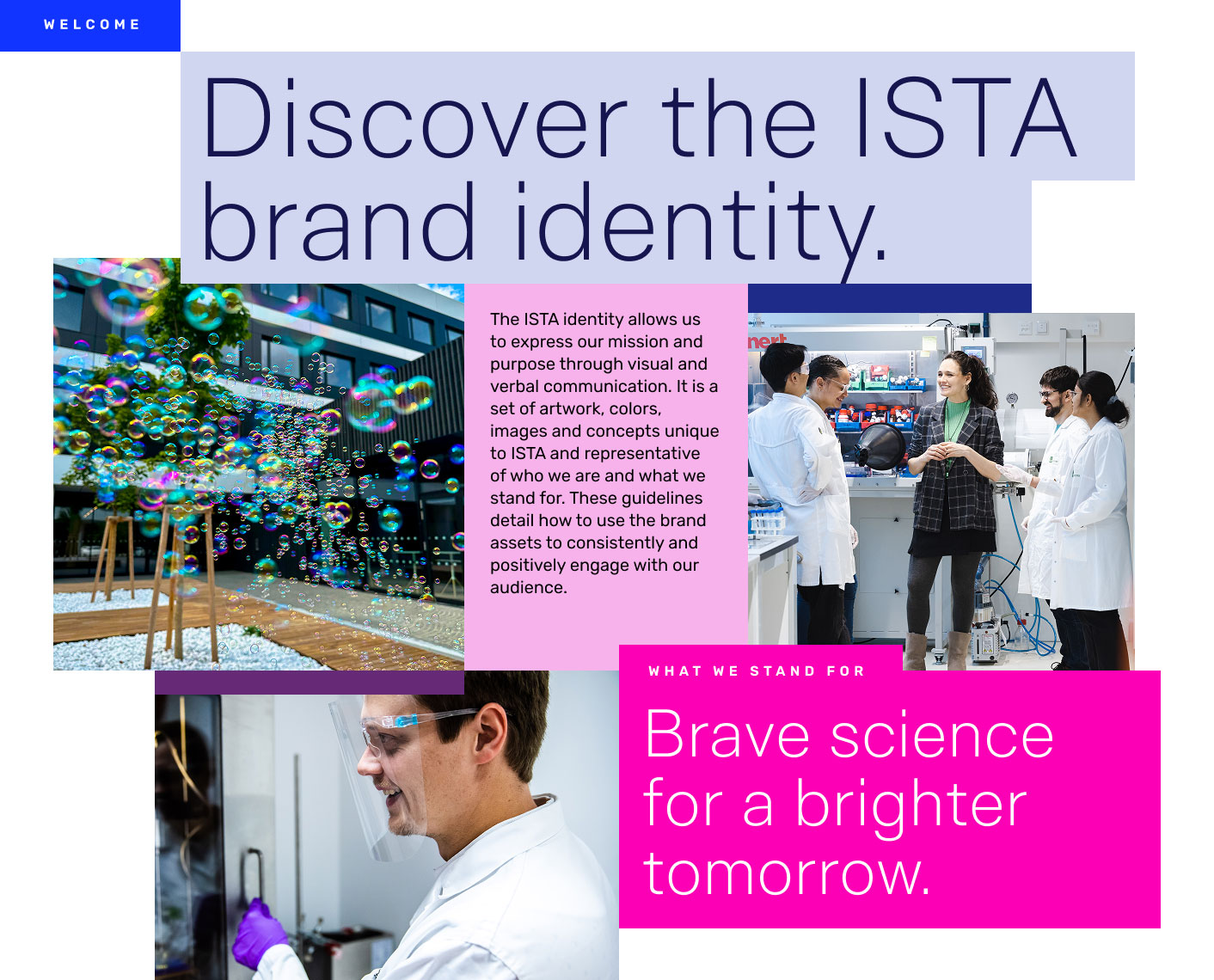
The ISTA identity allows us to express our mission and purpose through visual and verbal communication. It is a set of artwork, colors, images and concepts unique to ISTA and representative of who we are and what we stand for. These guidelines detail how to use the brand assets to consistently and positively engage with our audience.
We invite you to explore these brand guidelines and implement the ISTA brand across all communication channels. This will empower ISTA to build recognition and understanding with all those who encounter our institution—scientists, students, and the local and global public. Our brand provides a clear, unified message that reflects our mission and our collective pursuit to be a catalyst for progress.