Our colorful logo system is at the heart of the ISTA brand.
Below is a detailed review of the ISTA logo system. It includes several formats for maximum flexibility and while they can always be used in black or white, our true vibrancy and energy is conveyed through the colorful tone-on-tone options. You can find all logo files with instructions on the Downloads page.
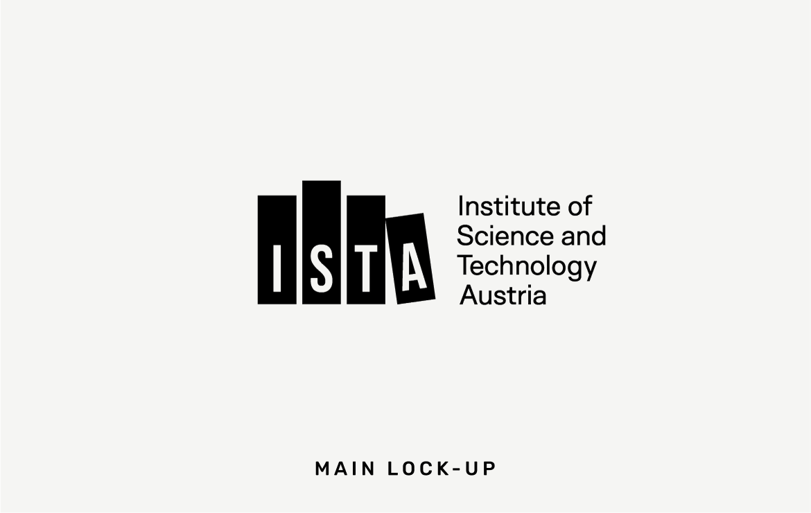
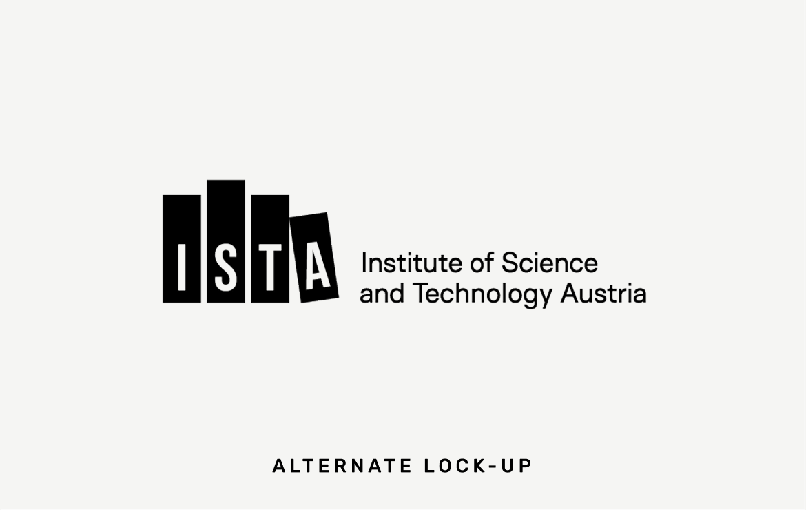
There are four components to the ISTA logo system: Main Lock-up, Alternate Lock-up, Icon, and Wordmark.
The Main Lock-up is used most frequently, particularly for external, more formal communications, or when introducing ISTA for the first time.
The Alternate Lock-up can be used when it suits the space better (ample horizontal space).
The ISTA Icon is an effective shorthand mark and can be used anytime the full lock-up is not needed. It’s especially appropriate for branded merchandise, for small spaces, internal communications, or in cases where the audience already knows the institution.
The Wordmark adds variety and interest to the logo system and works well at a larger scale. It can be used in place of the main lock-up, particularly when the audience is familiar with the brand.
Logo Clearspace
All versions of the logo should always have an appropriate amount of clearspace surrounding it, at least equal to the height of the A-bar in the icon (or two As stacked in the case of the Wordmark). This is the minimum amount of space that should surround any of the ISTA logos (err on the side of more, whenever space allows).
This space around the any of the components in the logo system should never be occupied by extraneous information. The space around the ISTA logo should always feel airy and not crowded.
Clearspace around the Main Lock-Up, Alternate Lock-Up, and ISTA Icon should be at least equal to the height of the A-bar in the icon.
Clearspace around the Wordmark should be at least 2x the height of the A in Austria.
Logo Color System
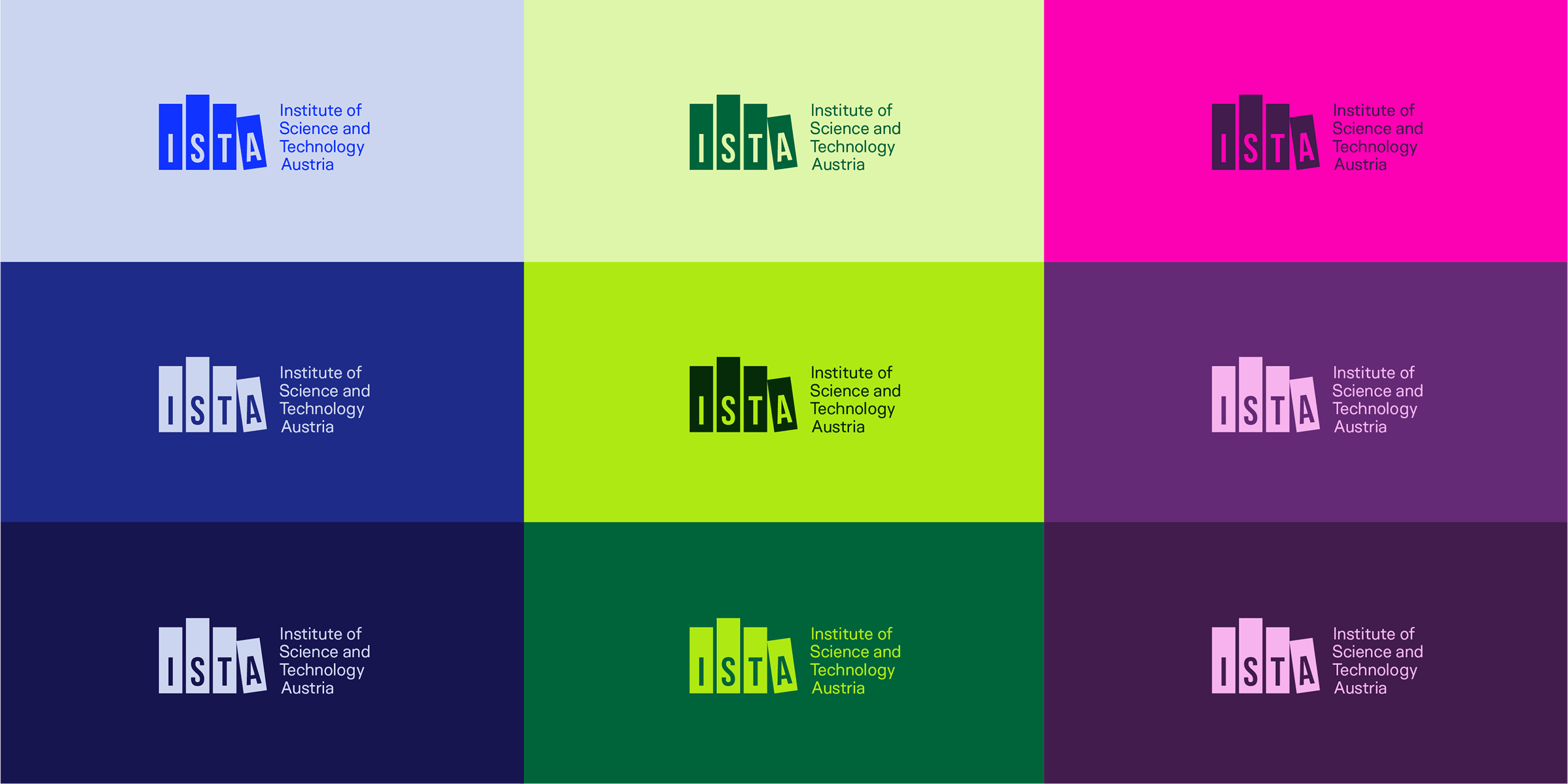
Most brands use the common approach of one or two primary colors that dominate all communications. The ISTA brand takes an unconventional, bold stance by embracing a wider palette, including for the logo system. While any of the logo assets can be used in black or white, particularly for formal occasions or when color is not an option, our colorful logo system is a vital part of the ISTA brand. The tone-on-tone application across the full color palette for the logo system reflects our inclusive, energetic campus. Learn more about the ISTA color palette in the next section.
Below are several examples of the tone-on-tone usage (use one of these recommended combinations or explore others). Based on the colors being used for any given piece, the logo can seamlessly integrate by appearing in the same color combinations.
This example, a digital banner created for Graduation Ceremony invitations sent by email, uses the green hues from the palette and the logo follows suit for a cohesive look.
Appropriate usage
Follow these dos and don’ts to ensure proper usage of the ISTA logo system. The following guidelines apply to ALL of the logo assets: Main Lock-up, Alternate Lock-up, Icon, and Wordmark.
Use the logo in any of the ISTA colors.
Use tone-on-tone color combinations with enough contrast for clear readability.
Use any of the logo artwork or lock-ups based on the available space.
Do not apply two different colors to any logo artwork. Logos should always be one color only.
Avoid color combinations that are too low in contrast and therefore hard to read.
Do not add a drop shadow to any logo. If you need to improve readability, use higher contrast colors.
Do not modify any of the logos to use a color outside of the ISTA palette.
Do not create new configurations or rearrange the logo in any way.
Do not create “logo-like” artwork by adding alternate text in place of the ISTA name. For organizational logo creation, please see the rules below.
Do not stretch, compress, or change the aspect ratio in any way.
Do not place the logo over a busy background where it’s hard to read or recognize.
Do not obscure the readability of the logo by placing it over a brand pattern.
Do not crop or cut off any part of the logo. Do not bleed the logo off the edge of the page or screen.
Do not rotate the logo or use it at an angle.
Do not use any of the former ISTA logos or brand colors. Always use the updated artwork.
Animated Logo
Use the animated version of the Main Lock-up or the Icon to add an element of motion and energy to digital communications. Avoid overuse of these animations, they should be reserved for high-impact opportunities and when the layout is simple enough to let the animation take center stage.
Divisional logos
All divisional logos should follow the same format including spacing, sizing, and font choice.
Using the same format as the primary ISTA logo, divisional or organizational logos should adhere to the grid structure outlined above and be aligned to the bottom of the logo, setting the department name in Surt Regular Normal. Do not exceed four lines. Do not exceed three words per line. Do not change the font, font size, tracking, or leading.
Divisional logos or any brand marks built within this official brand framework are limited to specific instances. If you need one of these logos created or want to request usage, please contact Communications. The following are general guidelines* for sub-brand logos:
Divisions/units/teams within ISTA, research groups (using "[Lastname] Group" next to ISTA icon), representative bodies at ISTA (e.g. Works Council, Postdoc Association, AURAS)
Projects, campus initiatives, lectures/seminars, building names, unofficial divisions/teams (e.g. Executive Leadership Team), campus groups (e.g. sustainability, salsa, volleyball), Events Office, campus community events
*Some exceptions apply; contact Communications if you have any questions.