Like ISTA itself—and derived from the rectangles of the logo—the grid is an open-ended framework that’s designed to facilitate creativity in a structured environment.
The ISTA brand visual system uses an underlying grid structure to aid layout development and maintain consistency across materials. The grid provides a shortcut for decision-making on spacing and proportions while allowing the flexibility required to represent a multifaceted, dynamic organization.
The grid can be used when designing any brand materials as a tool for guiding structure, but should never serve as a visible graphic element.
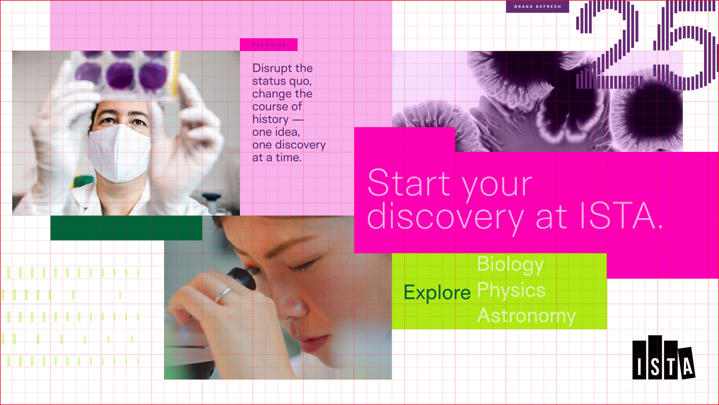
The image above shows how every element can align to the grid while still retaining a free-flowing composition. Text should left-align with a gridline and/or other elements in the composition (see “Our Vision” and the paragraph below it—these are aligned to connect the subhead with the copy.) For large copy within color blocks, use the grid to left-align the copy but the text does not have to base-align with the grid; optimize for the visual spacing within the container (see “Explore” in the bright green box. It is vertically centered, not sitting on a gridline.)
Notes
While the grid is designed to maintain order and consistency, there is a lot of room for flexibility. Feel free to experiment with the layout when you’re developing a composition.
Always keep in mind that the core element of ISTA’s layout structure is the rectangle.
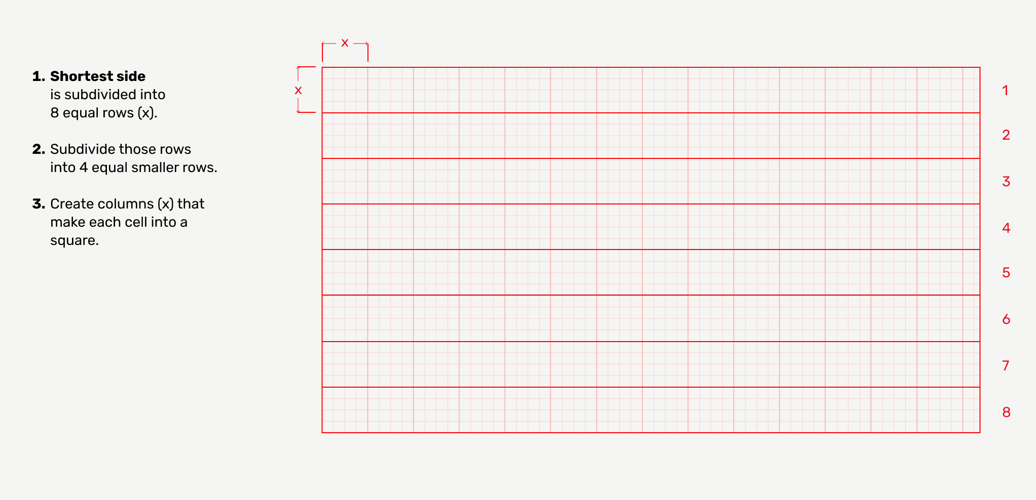
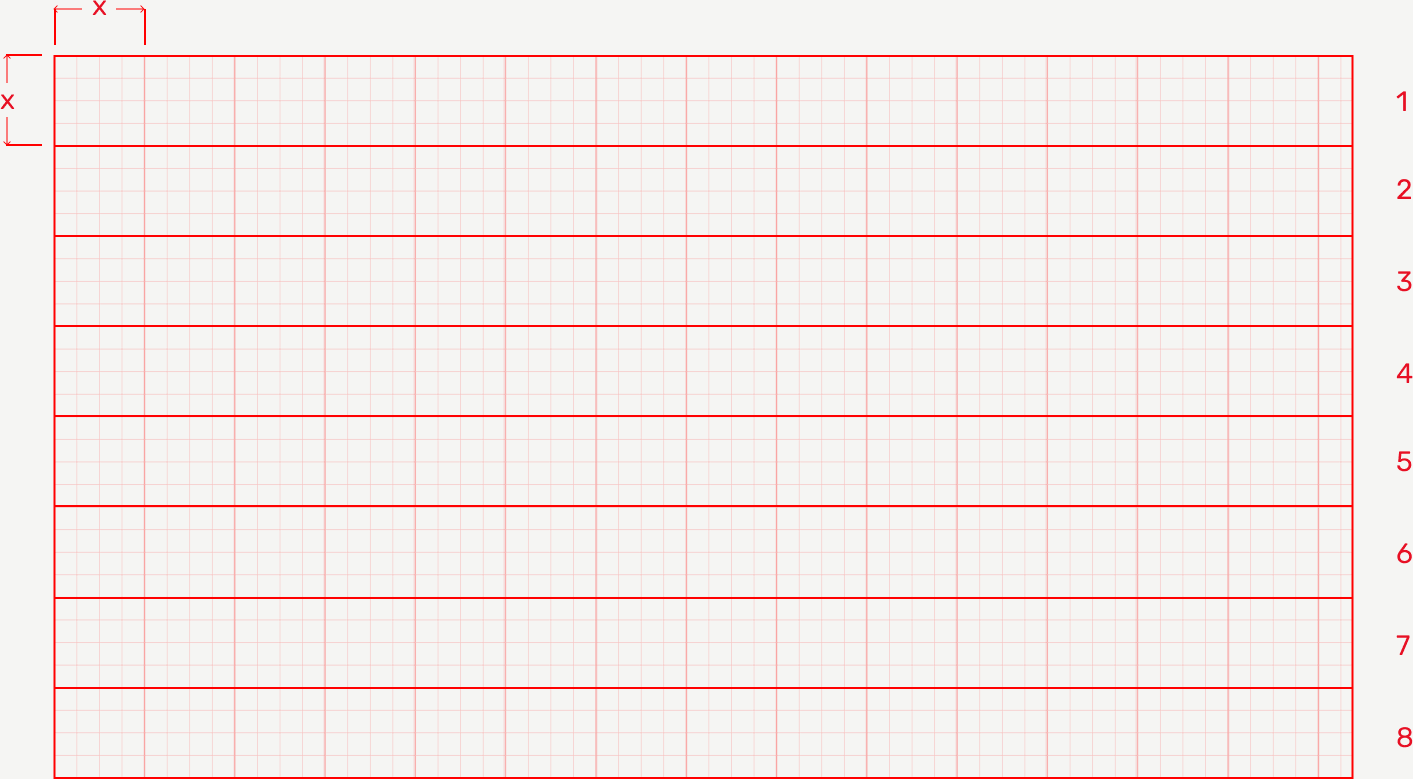
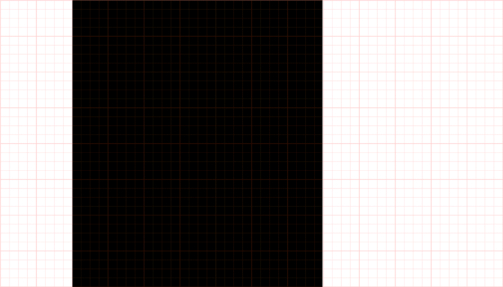
The ISTA grid can be set up by subdividing the shortest side of the page into 8 equal sections and then subdividing those columns or rows into 4 subsections. The grid cells should always be perfectly square.
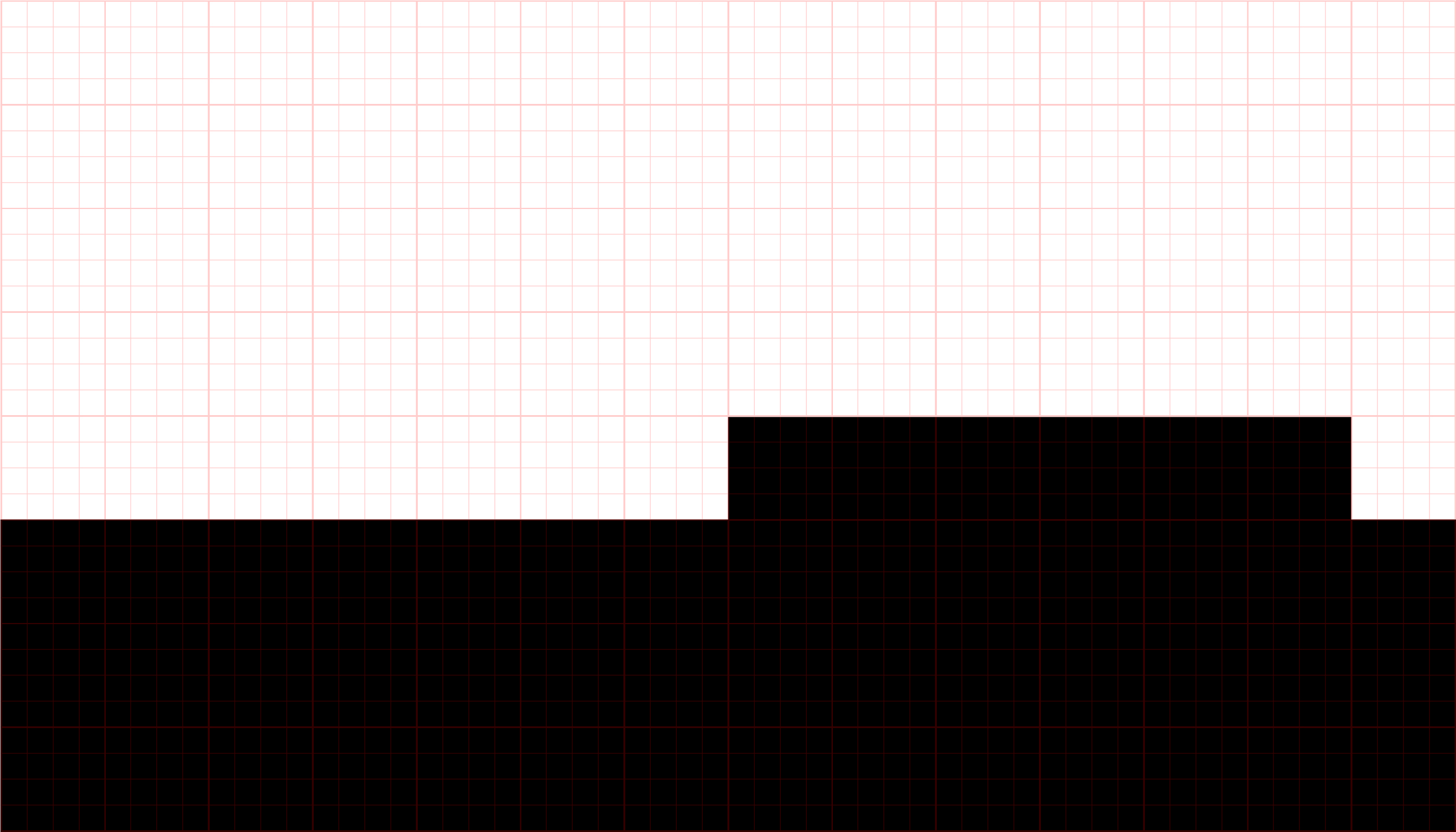
You may encounter page sizes that result in partial grid segments on one edge. This is fine; bleed elements off that edge or retain an additional full cell of margin — see example above (right edge). If the number of cells cannot be divided by four exactly, it is fine to leave 1 or even 1,5 squares out (or split the difference on both sides).
The grid structure can be used to create simple or complex layouts, depending on the need and your familiarity with design and composition. But no matter the complexity of the layout, a few elements will make a piece feel like ISTA:
Grid templates are available for download to help guide you. These templates can be used to help you align design elements.
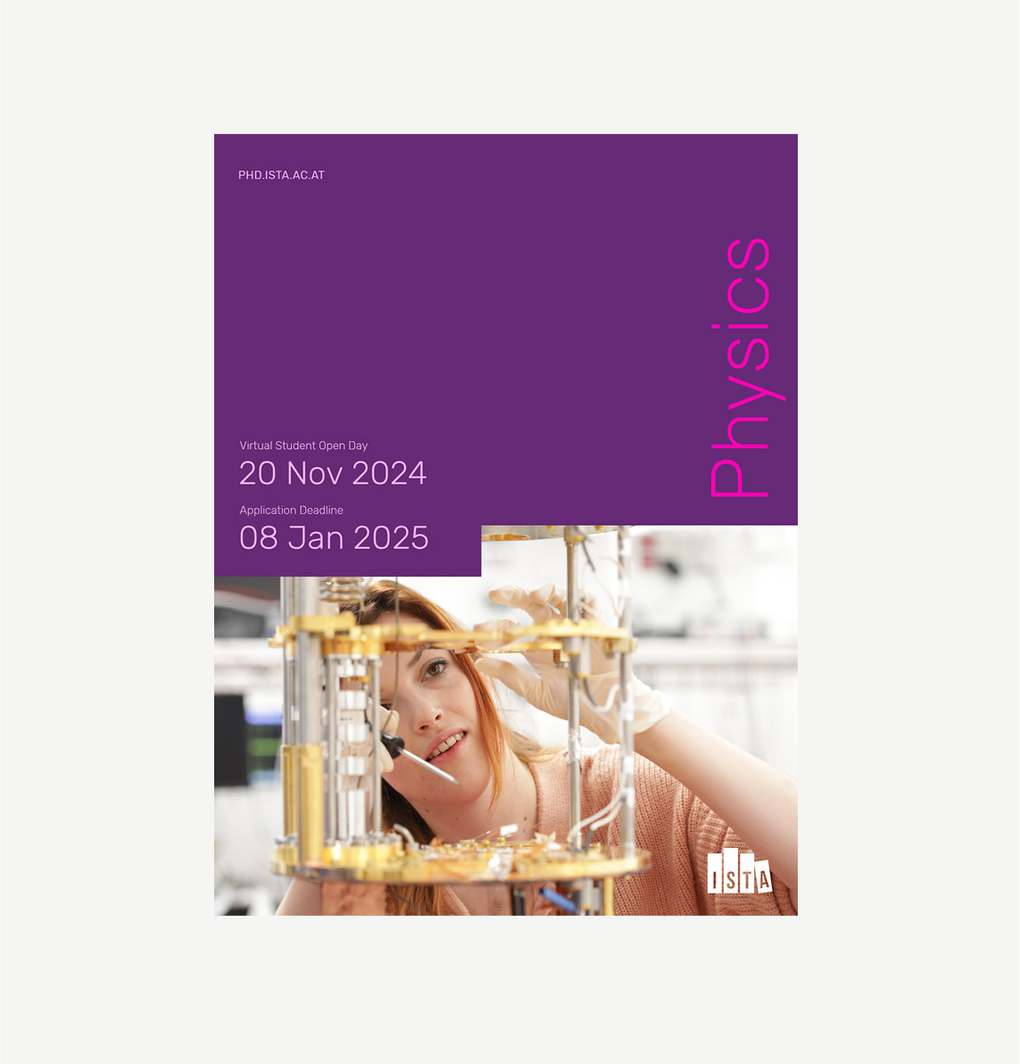
This example shows a more minimalistic composition for a conceptual study track brochure. While the layout is more simple than the following example, it’s still connected to the ISTA visual system through color, type, and the notch cut out of the image that allows the dates to nest in close with the image.
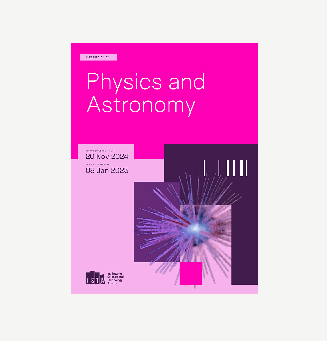
A more complex example of a conceptual study track brochure cover, this version uses overlapping color blocks, an isolated (transparent background) image, and one of the ISTA graphic elements to add depth, dimension, and energy to the composition.
Cutouts and blocking should be used to emphasize and add interest to the content. The grid and color blocks are not meant to be used as decoration or be the primary focus. In most cases, less is more. If you notice you’re using the blocks as the primary graphic element of a composition, it could be a sign that you need to introduce an image or a pattern instead.
Tip
When starting a composition, identify the element that will serve as the primary focus. Is it an image? Maybe a headline? How does the crop of the image affect the meaning?
Use that as an anchor point, and then add in the additional information, cutting into the frame of the image or color block to add interest and help connect the content.