In pursuit of our mission, ISTA has created VISTA and XISTA in order to broaden the impact of scientific research through science education and technology transfer, respectively. As part of the ISTA family, the logos are often seen together.
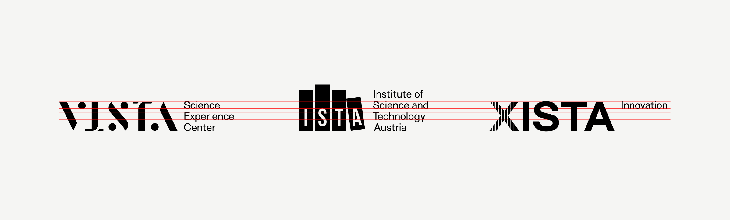
The ISTA family of brands, presented together, shows the proper scaling using a grid system based on the height of the “modifier”, or the text that accompanies the logomark to describe the brand.
In co-branded documents, the ISTA logo should always take first position (leftmost) and be divided by a 1 pt line that matches the height of the S bar in the ISTA logo. Spacing on either side of the dividing line should also be equal to the width of one of the bars in the ISTA logo. (Adjust manually if need be to create equal visual spacing.)
When all three logos are used together, the ISTA logo should always take first position (leftmost). Always use the Main Lock-up logo version for ISTA. VISTA and XISTA should follow in that order (they can be swapped if XISTA has a more prominent role, when appropriate). As detailed above, use the same 1 pt line and spacing to separate the logo artwork.
The preferred color scheme when using two logos or all three logos is one color. This provides balance and cohesion among the brands. This example uses white logos on a dark background.
Black logos on a white or light background also works.
External brands
When pairing the ISTA logo with other external logos, the recommendations for scaling and spacing are similar to logos within the ISTA brand family.
Where possible, ISTA should take first position (leftmost) and use a dividing line to separate the logos. The spacing between the two logos should be equal to the “IST” bars from the ISTA logo with the dividing line centered between them. Ensure legibility of both logos to the best of your ability while prioritizing the visual weight of the ISTA logo (assuming ISTA is the primary partner).
When pairing the ISTA logo with an organization that has a vertically oriented logo, the partner logo should not exceed the height of two S bars and should be centered vertically on the ISTA logo. Maintain ISTA as the primary visual weight of the lockup.